A brand built for riders, by riders.
Brand identity and website for a premium mountain bike retreat in Rotorua, created in-house from the first sketch to launch.
- Client
- Ride Retreat, an Outside In venture
- Services
- Brand strategy · Identity · Illustration · Website · Copywriting
- Location
- Rotorua, Aotearoa New Zealand
- Live site
- rideretreat.com (opens in a new tab)
The brief
Premium, without feeling corporate.
Rotorua has 200km of world-class singletrack and no shortage of ways to ride it. Ride Retreat needed to stand apart from shuttle operators and bike hire. It is a four-day, all-inclusive retreat with guided riding, coaching from Red Bull pro Brook Macdonald, a private chef, and a lodge with a Nordic sauna, spa and pool.
The brand had to speak to riders who want more than a weekend away, and the website had to turn that feeling into bookings.
The idea
Ride. Connect. Unwind.
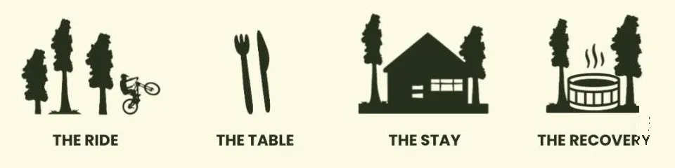
The best riding trips aren’t remembered for the trails alone, but for everything in between. The meal after a big day. The soak that fixes your legs. The stories told around the table. That became the organising idea, and four pillars that structure everything from the website to social content.
- Guided singletrack with a local legend
- Good food, great company, even better stories
- Laid-back luxury for rest and connection
- Steam, soak and slow down
The voice follows the same line: warm, experiential and rider-to-rider, with the confidence of a premium brand that never needs to shout.
Identity
Drawn from the redwood forest.
A bold, wide wordmark sits under a stand of hand-drawn trees, with a rider caught mid-air. It’s playful, unmistakably MTB, and works at any size, from a site header to a sticker on a top tube. A custom icon for each pillar does the job of a navigation system and a brand language at once.
Created by riders, for riders.
Luxury mountain bike retreat in Rotorua. Ride. Connect. Unwind.
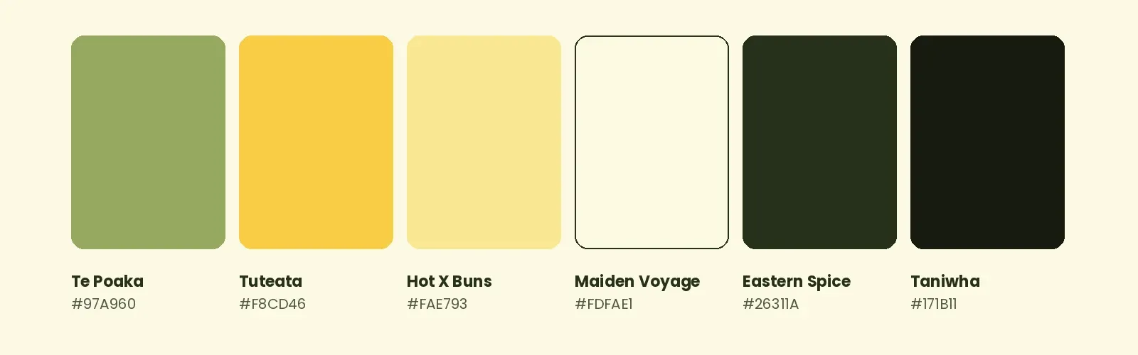
From the forest floor. Deep greens and moss tones, lifted by warm, sunlit yellows and a soft cream base.
Six named colours: Te Poaka, Tuteata, Hot X Buns, Maiden Voyage, Eastern Spice and Taniwha.
Website
Feels like the retreat itself.
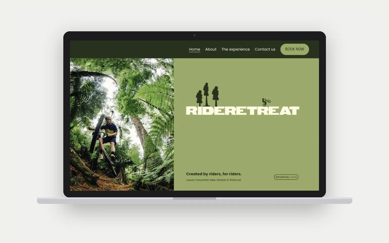
Relaxed, considered, nothing to think about. A split hero pairs full-bleed forest riding with the wordmark on moss green, so the brand and the experience land together in the first second.
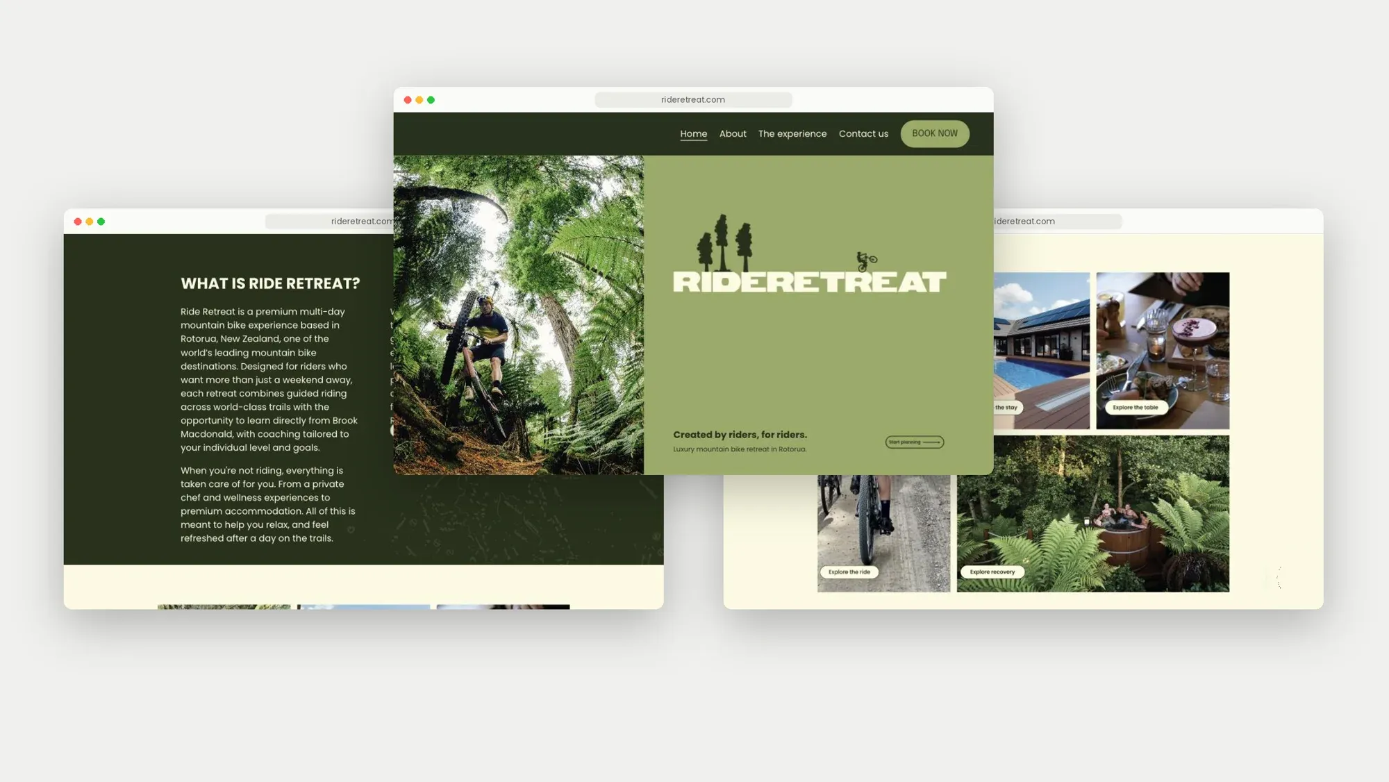
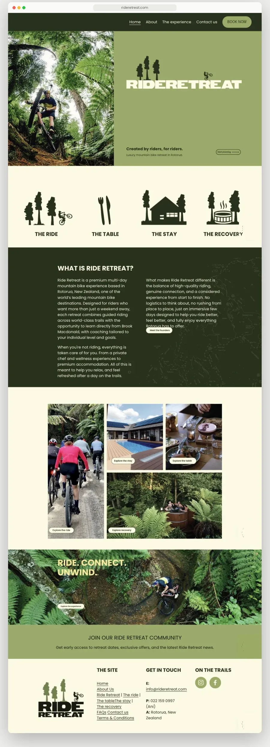
Below the hero, the four pillar icons become the site’s main way in. Each opens a dedicated page with the key numbers up front, followed by the detail riders need to say yes.
- 200kmof singletrack
- 150trails
- 13guests in a seven-bedroom lodge
The copy leads with experience over features and answers the real questions early: who it’s for, what’s included, and how booking works. Every page builds toward one clear call to action: Book now.
Outcome
Sells on feel, not price.
Ride Retreat launched with a complete, ownable brand and a website that sells a high-value experience. The identity now carries across social, merchandise and the guest experience, all from one system.
Visit rideretreat.com (opens in a new tab)